Most GTM teams pour budget into generating inbound demand, then watch half their qualified leads disappear between the form fill and the booked meeting. The gap between a 40% qualified-to-booked rate and a 78% rate isn't about traffic quality or ad spend. It's about what happens in the 30 seconds after someone clicks "Book a Demo" and whether your team can see where leads are falling out. A demo funnel dashboard in Salesforce gives you that visibility, but only if it's built to track the right things. The default reports most teams rely on obscure the very friction points that cost them pipeline. What follows is a practical guide to constructing a Salesforce dashboard that reveals the truth about your demo funnel, from qualification through booked meeting, and helps you act on it quarterly.
The Blind Spot in Modern Inbound: Why Your Funnel Data is Lying
Standard Salesforce reports show you leads created and opportunities won. They rarely show you the messy middle: what happened between form submission and the first real conversation. That middle is where most pipeline leaks live, and most dashboards treat it as a black box.
The problem isn't a lack of data. It's that the data sits in disconnected systems: your form tool, your routing logic, your calendar platform, and your CRM. Without stitching these together in a single view, you're making decisions based on incomplete information. Your marketing team thinks the funnel is healthy because MQLs are up. Your sales team thinks leads are bad because show rates are down. Neither is seeing the full picture.
The Decay of Intent: Tracking the 30 Seconds After Form Submission
Intent doesn't hold. A prospect who fills out a demo request form has roughly an 80% probability of booking if they see a calendar immediately. Wait until the next day, and that probability drops to around 40%. By the time an SDR manually reviews the lead and sends a follow-up email two days later, you've already lost the majority of potential meetings.
Your dashboard needs to capture this decay. That means tracking the timestamp of form submission alongside the timestamp of calendar presentation and the timestamp of the booked meeting. If there's a gap between submission and calendar, you've found your leak. Most Salesforce instances don't capture this by default, which is exactly why custom configuration matters.
Why Traditional Lead-to-Meeting Tracking Fails GTM Teams
The classic lead lifecycle in Salesforce moves from Lead to MQL to SQL to Opportunity. This works fine for reporting on volume. It fails completely at diagnosing conversion friction. The stages are too coarse. A lead can sit in "MQL" status for days while intent decays, and your dashboard won't flag it.
What you need instead is a sub-stage view that tracks qualification outcome, calendar presentation, booking confirmation, and meeting completion as distinct, timestamped events. Without this granularity, you're reporting on outcomes without understanding the process that produced them.
Defining Key Performance Indicators for the Demo Funnel
Before you build a single dashboard component, you need to define what you're measuring and what "good" looks like. The core metric for a demo funnel is qualified-to-booked rate: the percentage of leads who pass your qualification criteria and actually end up with a meeting on the calendar.
Based on aggregate data from over one million B2B SaaS form submissions, the median qualified-to-booked rate is 62%. The top 10% of companies hit 78% or higher, and the best performer in the dataset reached 88%. If your team is converting at 30-40% and assuming that's normal, you're leaving significant pipeline on the table.
Benchmarking Success: From Median (62%) to Elite (78%+) Conversion Rates
Your dashboard should include a benchmark component that shows your current qualified-to-booked rate against these thresholds. A simple gauge chart in Salesforce works well here: green zone above 78%, yellow between 62% and 78%, red below 62%.
Track this metric monthly, not just quarterly. Monthly granularity reveals seasonal patterns that quarterly aggregates hide. The data shows Q2 (April through June) consistently performs above 60%, while Q3 dips, driven almost entirely by August at 53.4% and September at 53.7%. Knowing this helps you set realistic targets and avoid false alarms when late-summer numbers soften.
Measuring the Impact of Commitment Language on Meeting Rates
One surprisingly measurable variable is the language on your CTA buttons. Among top-performing companies, 29% use "Book a Demo," 21% use "Get a Demo," and 12% use "Schedule a Demo." Only 12% use "Request a Demo." Commitment language consistently outperforms permission language.
Your dashboard can track this by segmenting conversion rates by lead source or landing page. If you're running multiple CTAs across different pages, tag each form with its CTA variant in Salesforce and compare qualified-to-booked rates across segments. This turns your dashboard into a testing tool, not just a reporting one.
Configuring Salesforce Custom Fields for Granular Tracking
Out-of-the-box Salesforce fields won't capture the data your demo funnel dashboard needs. You'll need to create custom fields on the Lead and Contact objects that track qualification status, disqualification reason, calendar presentation timestamp, booking timestamp, and meeting outcome.
Keep your field architecture clean. Use picklist fields for categorical data like DQ reason and datetime fields for timestamps. Avoid free-text fields where a picklist will do: they're impossible to report on reliably. Every field you add should answer a specific question that changes how you route leads or coach reps.
Capturing Qualification Data: Form Responses vs. CRM History
The best qualification decisions use both form data and CRM history. A lead might submit a form with a personal email and a two-person company, which looks like a bad fit. But if your CRM shows they're associated with an enterprise account that's already in pipeline, you'd want to route them differently.
Build your Salesforce fields to capture both dimensions. Include fields for form-submitted company size, enriched company size (from your data provider), and CRM account match status. This lets your dashboard show where form data and CRM data disagree, which is often where qualification errors hide.
Tracking Disqualification (DQ) Rates to Optimize Sales Time
DQ rate is one of the most misunderstood metrics in the funnel. A high DQ rate isn't inherently bad. Companies with stricter qualification criteria often have higher qualified-to-booked rates because the leads who do get through are genuine fits. Reps aren't wasting time on poor matches, and qualified leads are more likely to show up and engage.
If your DQ rate is under 20% and your meeting rate is struggling, you might be letting too many unqualified leads through. Create a DQ rate report in Salesforce segmented by DQ reason. Review it quarterly. Ask whether each disqualification criterion is filtering out genuinely poor fits or just adding friction. Enterprise teams selling high-ACV deals should expect and welcome a higher DQ rate than SMB-focused teams running a high-velocity motion.
Building the Dashboard Components: From Lead to Booked Meeting
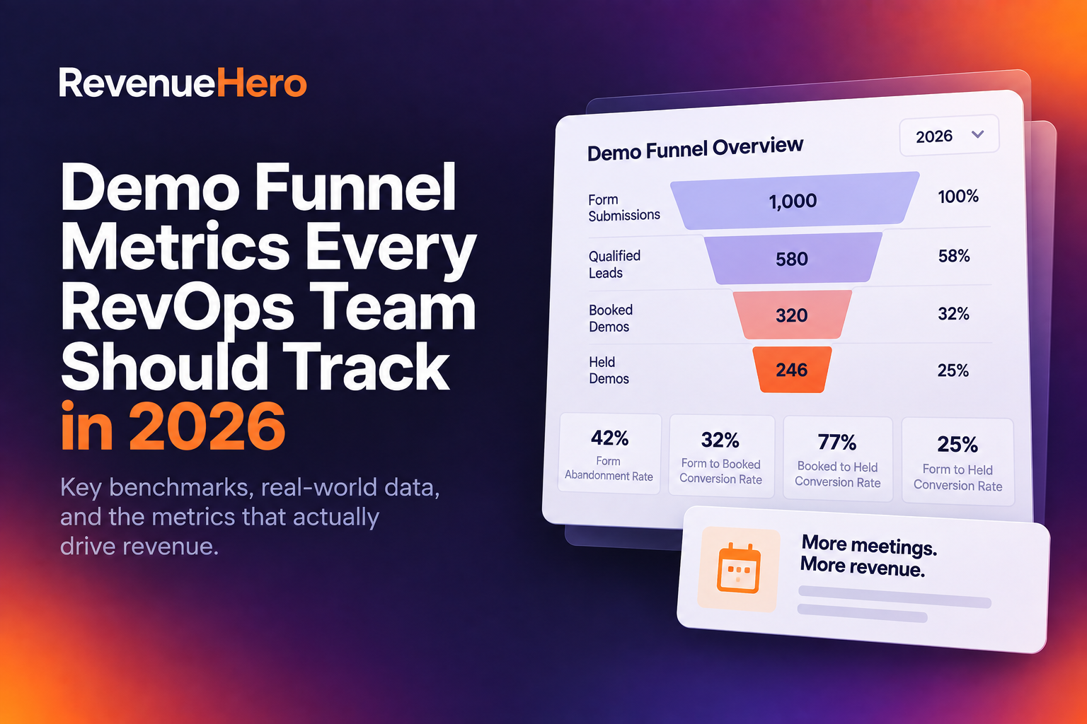
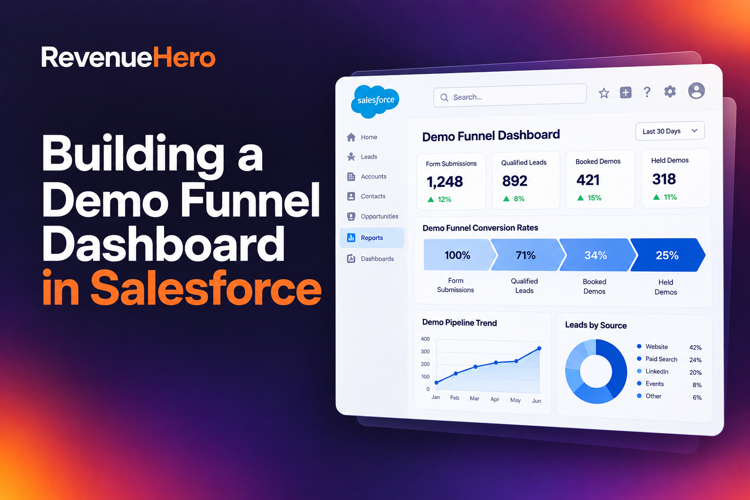
Your Salesforce dashboard for the demo funnel should have four core components: a funnel visualization showing volume at each stage, a qualified-to-booked rate gauge, a DQ breakdown by reason, and a time-series chart showing monthly trends. Resist the urge to add more. Dashboard clutter kills adoption.
For the funnel visualization, use a stacked bar chart or a Salesforce funnel report type. Show total form submissions, qualified leads, calendar presentations, booked meetings, and completed meetings as distinct stages. Each drop-off between stages represents a specific process failure you can investigate.
Visualizing the Qualified-to-Booked Gap
The gap between "qualified" and "booked" is where your demo funnel dashboard earns its keep. This gap represents leads who passed qualification but never got a meeting on the calendar. Common causes include slow routing, calendar availability issues, timezone mismatches, and leads who qualified but abandoned before selecting a time.
Build a report that filters for leads with a qualification timestamp but no booking timestamp. Add a column for time elapsed between qualification and the current date. Any lead sitting in this gap for more than 24 hours is almost certainly lost. Your dashboard should surface these leads daily so ops or sales can intervene.
Monitoring Seasonal Trends and Monthly Meeting Rate Fluctuations
A monthly trend line is essential for separating signal from noise. Without it, a bad August triggers panic when it's actually a predictable seasonal pattern. The data shows July performs well at 61.1%, but August and September drag Q3 down to 55.9% overall.
Configure a Salesforce report that groups qualified-to-booked rate by month. Display it as a line chart on your dashboard with a reference line at 62% (the median). This gives your team instant context: are we underperforming relative to our own history, or is this a market-wide pattern? Plan your biggest inbound campaigns for Q2, when conversion rates consistently peak.
Integrating Real-Time Routing Data into Your Salesforce View
Your Salesforce dashboard is only as good as the data feeding it. If routing decisions happen outside Salesforce and results aren't synced back, you're building reports on incomplete information. The routing layer, where leads get matched to reps based on territory, account ownership, or product interest, needs to write its outcomes directly into your CRM.
This means every routing decision should create or update a Salesforce record with the assigned rep, the routing rule that fired, and the timestamp. Without this, you can't diagnose routing failures from your dashboard. You'll know a lead wasn't booked, but you won't know if it was because the wrong rep got it or because no rep was available.
Connecting RevenueHero Data for Instant Qualification Insights
RevenueHero qualifies leads using form responses, enrichment data, and CRM history in real time, then syncs meeting outcomes and statuses back to Salesforce automatically. This bidirectional sync means your dashboard reflects what actually happened, not what someone remembered to log.
The practical benefit is that your dashboard components for qualification rate, DQ breakdown, and routing accuracy all populate without manual data entry. When a lead submits a form, gets qualified, sees a calendar, and books a meeting, every step is recorded in Salesforce with timestamps. This is the foundation that makes a demo funnel dashboard trustworthy rather than aspirational.
Using Your Dashboard to Drive Quarterly Process Improvements
A dashboard that gets looked at once and forgotten is a waste of configuration time. Schedule a quarterly review where your RevOps, demand gen, and sales leaders sit down with the dashboard and ask three questions: Where is the biggest drop-off in the funnel? Has our qualified-to-booked rate moved toward or away from the 78% benchmark? Are our DQ criteria still aligned with our ICP?
Each quarter, pick one process change based on what the dashboard reveals. Maybe it's tightening qualification criteria because your DQ rate is too low and reps are taking meetings with poor fits. Maybe it's changing CTA language on your highest-traffic landing page from "Request" to "Book." Maybe it's fixing a routing rule that's sending West Coast leads to East Coast reps at 5 PM.
The companies that reach elite conversion rates aren't doing anything complicated. They're measuring the right things, reviewing them regularly, and making small adjustments that compound over time. Your Salesforce dashboard is the mechanism that makes this discipline possible. Build it with the fields and components described here, connect it to real-time routing data, and commit to acting on what it shows you. The difference between 40% and 78% is sitting in your funnel right now, waiting to be found.
Let RevenueHero help your team turn high-intent users into booked meeting without slowing down your funnel.